




Beyond Beige: How Colour Psychology Shapes the Luxury Hotel Experience
Posted by Luxury Group International Design Team / Luxury Hotel Interior / August 19, 2026
Guests may not consciously remember the exact shade of a hotel wall, yet colour can influence how calm, energised, intimate, or sophisticated a space feels within seconds. In premium hospitality, color psychology is therefore more than decoration. It becomes a strategic part of the guest experience.
From calming coastal blues to deep burgundy lounges and warm stone bedrooms, successful hotel color schemes respond to climate, culture, architecture, and brand identity. When those elements are coordinated with luxury hotel furnitures, lighting, textiles, and carefully selected hotel decors, colour can make guests feel more comfortable spending time within the property.
Why Colour Matters in Luxury Interiors
Environmental psychology has long associated colour with emotional and behavioural responses. Softer blues and greens are commonly connected with calmness, while warmer earthy tones can create intimacy and security. Deep jewel tones often communicate richness, exclusivity, and drama.
For luxury interiors, however, the strongest results rarely come from one dominant colour.
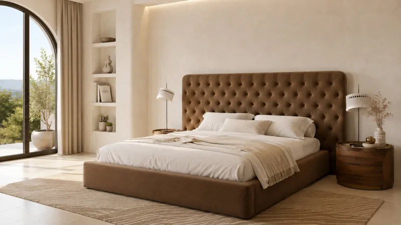
Instead, designers build layered palettes. A neutral architectural foundation may be combined with walnut furniture, bronze lighting, emerald upholstery, or muted terracotta hotel decors.
This approach allows color psychology to influence atmosphere without making the interior feel overly themed.
Choose Hotel Color Schemes According to Climate
Climate should strongly influence colour selection.
Mediterranean and southern European hotels often benefit from chalky whites, sand, terracotta, olive, and ocean-inspired blues. These tones connect indoor spaces with bright natural surroundings while creating a cooler visual atmosphere.
In northern European destinations, warmer neutrals, chocolate brown, burgundy, forest green, and amber can make interiors feel more inviting during darker seasons.
The surrounding light also changes how hotel color schemes appear. A beige that feels sophisticated in warm sunlight may look flat beneath cooler artificial lighting. Designers should therefore test finishes, upholstery, and luxury hotel furnitures under both daytime and evening conditions.
Culture and Brand Identity Matter Too
Colour cannot be separated from cultural meaning.
A heritage hotel may use burgundy, navy, antique gold, and deep wood tones to reinforce tradition. A contemporary wellness property might prefer sage, limestone, soft grey, and natural timber.
Meanwhile, an urban fashion-led hotel can experiment with black, aubergine, brass, or dramatic monochrome contrasts.
The strongest hotel interiors use colour to tell guests what kind of experience they are entering before any explanation is required.
Match Colour to the Guest Emotion You Want
Different hotel zones can support different emotional goals.
For bedrooms, softer neutrals, blue-greens, and muted earthy colours encourage visual calm. Social lounges can accommodate richer palettes that stimulate conversation, while restaurants may introduce warmer shades to create energy and intimacy.
Luxury hotel furnitures can become the colour anchor. A velvet green sofa, sculptural burgundy chair, or ivory upholstered bed can establish the palette without requiring dramatically coloured walls.
This makes future updates easier because hotel decors, cushions, rugs, artwork, and lighting can refresh the room seasonally.
A Seasonal Palette Guide
Spring: sage green, blush, ivory, and light oak for freshness.
Summer: Mediterranean blue, warm white, sand, and pale stone for airy sophistication.
Autumn: rust, olive, caramel, walnut, and muted gold for warmth.
Winter: burgundy, chocolate, charcoal, forest green, and brass for enveloping luxury.
Seasonal accents allow luxury interiors to evolve while preserving the hotel’s permanent design identity.
Quick Colour Psychology Quiz
What should guests feel most strongly?
Calm and restored? Choose sage, blue-grey, stone, and natural timber.
Pampered and glamorous? Consider burgundy, emerald, black, and brushed gold.
Warm and at home? Explore caramel, terracotta, cream, and walnut.
Fresh and contemporary? Try ivory, soft grey, muted green, and restrained metallic accents.
Colour That Makes Guests Want to Stay
Great color psychology should never feel obvious. Guests simply notice that a room feels peaceful, intimate, elegant, or energising.
When intelligent hotel color schemes are coordinated with lighting, textures, luxury hotel furnitures, and thoughtful hotel decors, colour becomes part of the hospitality itself.
The most successful palette does not merely make a hotel photograph beautifully—it makes guests feel they have found somewhere worth lingering.
RECENT POSTS
-
The Art of Sitting Beautifully: Upholstered Bench Designs Where Comfort Meets Craftsmanship
October 08, 2026
-
Modern Luxury Lighting Trends That Are Quietly Transforming Elegant Interiors
October 08, 2026
-
The Quiet Power of Luxury Statues: Sculptural Accents for Opulent Interiors
October 07, 2026
-
The Art of Calm: Why Elegant Bedroom Furniture Never Feels Overwhelming
October 07, 2026
-
Royal Dressing Tables: The Elegant Centrepiece of a Sophisticated Bedroom
October 06, 2026
-
The Perfect Glow: How Luxury Dining Chandeliers Transform Formal Dining Spaces
October 06, 2026
-
When Lighting Becomes Art: Luxury Chandelier Designs That Define Grand Interiors
October 05, 2026
-
The Art of Entertaining: Luxury Bar Cabinets That Turn Home Lounges Into Statement Spaces
October 05, 2026
-
The Quiet Luxury Bathroom: Why Hidden Bathtubs Are Defining 2026
October 04, 2026
-
The Timeless Allure of Round Marble Coffee Tables in Luxury Interiors
October 04, 2026